Lesson 09 / Layout
Box Model and Layout
Understand how elements are visually rendered, how their dimensions are calculated, and how display, float, flexbox, and grid affect layout.
Course Role
Core
Part of the main course path. Prioritize this before moving to optional polish or deeper references.
Teacher Notes / In-Class Use
Demo Live
- Walk through the interactive demo before students start changing their own project files.
- Connect the demo back to the first goal: Explain content, padding, border, margin, and box-sizing
Try In Class
- Build a content card using `padding`, `border`, `margin`, and `box-sizing`.
- Have students make one visible change, save, refresh, and explain what changed.
Submit Or Check
- Ask students to show the work in the browser, not only in the editor.
- Have students commit their progress with a clear message when the checkpoint is stable.
Watch For
- Students copying code without checking file paths, spelling, or capitalization.
- Visual changes that work locally but break when the project is published.
Learning Goals
- Explain content, padding, border, margin, and box-sizing
- Compare block-level and inline element behavior
- Identify common CSS layout techniques
Interactive Demo
How to use this demo.
Use the demo as a small lab. Change one thing, observe the result, then connect it back to your own project.
What To Try
- Adjust content width, padding, border, and margin to see each layer change.
- Switch box-sizing and compare how the total rendered size responds.
What Changes
- The visual box updates while the code sample shows the related CSS.
- Spacing changes become easier to diagnose when each layer is separated.
What To Notice
- Padding is inside the border, margin is outside the border.
- border-box makes element sizing easier to reason about in layouts.
Apply It
- Inspect one project card or content block and identify its content, padding, border, and margin.
Interactive Demo
Box Model Visualizer
Adjust the controls to see how width, padding, border, margin, and box-sizing change the space an element occupies.
.box {
  box-sizing: content-box;
  width: 220px;
  padding: 24px;
  border: 6px solid;
  margin: 24px;
}
What to notice
- Padding creates space inside the border.
- Margin creates space outside the border.
- box-sizing changes how width is calculated.
Try this
- Increase padding and watch the content move inward.
- Switch between content-box and border-box.
- Recreate the generated CSS in your own card component.
This demo uses extra JavaScript for teaching. The code sample shows the pattern to practice. View full demo source.
What This Teaches
This lesson teaches how every visible element on a webpage is drawn as a box.
You will learn how content, padding, border, margin, and box-sizing affect the space an element takes up.
You will also learn how basic layout techniques like display, float, flexbox, and grid change how elements arrange themselves.
Why It Matters
Most layout problems are box model problems first.
When spacing looks strange, elements overflow, columns do not line up, or a card is wider than expected, the answer is often padding, margin, border, or box-sizing.
Understanding the box model gives you a reliable way to debug layout instead of guessing at random CSS properties.
Core Concept: Block vs. Inline Behavior
HTML elements are broadly categorized as either block-level or inline elements, each with distinct behaviors.
Block-level elements
- Occupy the full width available to them by default.
- Create line breaks before and after the element, stacking vertically.
- Respect
widthandheightproperties. padding,margin, andborderapply and affect the layout of surrounding elements.- Examples:
h1,p,div,ul,form,table.
Inline elements
- Only occupy the space needed for their content.
- Flow within a line of text, not creating line breaks.
- Ignore
widthandheightproperties. - Vertical
padding,margin, andborderapply but don't affect the positioning of other inline elements. - Horizontal
padding,margin, andborderapply and affect the positioning of other inline elements. - Examples:
span,a,img,strong,em.
Block, Inline, and Inline-block Example
inline-block is useful for links that should look like buttons because the element still flows inline but accepts padding, width, and height.
<div>Block element</div>
<p>Another block element</p>
<span>Inline element</span>
<a href="#">Inline link</a>
Core Concept: The CSS Box Model
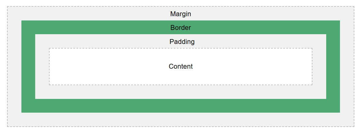
Every element on a web page is treated as a rectangular box, composed of content, padding, border, and margin.
Box Model Anatomy
The box model has layers. Start from the content and move outward.
Complete Card Example
This example combines the main box model properties in one reusable card.
.card {
  box-sizing: border-box;
  width: 320px;
  padding: 1rem;
  border: 2px solid #1f2937;
  margin: 1rem;
  background-color: #f4faf5;
}
Box Layer: Content
The actual content of the element, such as text, images, or other media. The height and width of the content area determine the element's natural size.
Box Layer: Padding
The space between the content and the border. Padding is transparent and expands the background color of the element.
p {
  background-color: lightblue;
  padding: 20px;
}
Box Layer: Border
A visual boundary surrounding the padding and content. Borders can have different styles, colors, and thicknesses.
div {
  border: 2px solid black;
}
Box Layer: Margin
The space outside the border, creating separation between elements. Margins are transparent and can collapse with adjacent vertical margins.
h1 {
  margin-bottom: 1em;
}
Core Concept: box-sizing
The box-sizing property determines how the width and height of an element are calculated.
Many developers prefer border-box because it makes element sizing easier to predict.
content-box: The default.widthandheightinclude only the content area.border-box:widthandheightinclude content, padding, and border, but not margin.
div {
  width: 200px;
  padding: 20px;
  border: 5px solid black;
  box-sizing: border-box; /* Total width will still be 200px */
}
content-box vs. border-box
| Value | How size is calculated | What to expect |
|---|---|---|
content-box | width includes only the content area. | The final rendered size grows when padding or border is added. |
border-box | width includes content, padding, and border. | The final rendered size is easier to predict. |
Global box-sizing Reset
Many projects set every element to border-box so sizing is more predictable across the site.
*,
*::before,
*::after {
  box-sizing: border-box;
}
Margin Collapse
Vertical margins between block elements can collapse. That means two vertical margins may combine instead of adding together.
If spacing feels smaller than expected, inspect the element and check whether vertical margins are collapsing.
The space between the h1 and p may be 2rem, not 3rem, because the vertical margins can collapse.
h1 {
  margin-bottom: 2rem;
}

p {
  margin-top: 1rem;
}
Which Spacing Should I Use?
| Need | Use |
|---|---|
| Space inside a box | padding |
| Space between separate boxes | margin |
| Space between flex or grid children | gap |
| Space between text lines | line-height |
Core Concept: Layout Techniques
CSS includes several layout techniques for controlling how elements are displayed and arranged.
Different layout tools solve different layout problems. The trick is choosing the right one.
Code Example: display Property
display: none;hides the element completely.display: block;makes the element a block-level element.display: inline;makes the element inline.display: inline-block;combines block and inline behaviors.
.hidden {
  display: none;
}

.button-like-link {
  display: inline-block;
  padding: 0.5rem 1rem;
}
Float
float: left; or float: right; allows content to wrap around the floated element.
Today, float is mostly useful for wrapping text around images. Avoid using it for modern page layout when flexbox or grid would be simpler.
Flexbox
display: flex; enables the Flexbox layout model for one-dimensional layouts.
Use gap to create spacing between flex children instead of adding margins to every child.
.card-row {
  display: flex;
  gap: 1rem;
}
Grid
display: grid; allows for two-dimensional layouts with rows and columns.
Use gap to create consistent spacing between grid rows and columns.
.card-grid {
  display: grid;
  grid-template-columns: repeat(3, 1fr);
  gap: 1rem;
}
Common Mistakes
| Mistake | Why it happens | Fix |
|---|---|---|
| Card is wider than expected | content-box adds padding and border outside the declared width. | Use box-sizing: border-box. |
Using margin for internal space | margin creates space outside the element. | Use padding for space inside the box. |
Using padding between separate boxes | padding increases internal space instead of separating siblings. | Use margin or gap. |
Inline element ignores width or height | Inline elements do not respect width and height like blocks. | Use display: inline-block or display: block. |
Using float for modern layout | float was not designed for page layout systems. | Use flexbox or grid for layout. |
| Vertical spacing is smaller than expected | Adjacent vertical margins may collapse. | Inspect margins or use padding/gap where appropriate. |
Debugging Checklist
- Inspect the element in browser developer tools and look at the box model diagram.
- Hover the DevTools box model diagram to see
margin,border,padding, andcontenton the page. - Check whether the element is
block,inline,inline-block,flex, orgrid. - Check the computed
box-sizingvalue. - Toggle
padding,margin, andborderrules on and off. - Temporarily add a border or background color to see the real size of the element.
- Check whether spacing is coming from
padding,margin,gap, orline-height. - Set
box-sizing: border-boxwhen sizing feels unpredictable. - Remove layout rules one at a time to find which property is creating the issue.
Resources
Checkpoint
Before moving on, make sure these feel true.
- I can explain the main concept in my own words.
- I can apply this lesson to my current project.
- I can verify the result in the browser.
- I can commit the change with a clear message.
Project Connection
This lesson supports current class projects.
Practice
- Build a content card using
padding,border,margin, andbox-sizing. - Apply a global
border-boxreset. - Create internal card spacing with
padding. - Create separation between cards with
marginorgap. - Create a row of cards with
display: flexandgap. - Inspect the card in DevTools and identify
content,padding,border, andmargin. - Intentionally switch the card to
content-boxand observe how the final size changes.