Lesson 13 / Design
Hero Sections
Design responsive hero sections that make a strong first impression, communicate a clear message, and guide users toward action.
Course Role
Core
Part of the main course path. Prioritize this before moving to optional polish or deeper references.
Teacher Notes / In-Class Use
Demo Live
- Model the core workflow from the lesson using a small class example.
- Connect the example back to the first goal: Understand why above-the-fold content still matters
Try In Class
- Build a responsive hero section with a hero image, headline, supporting text, and CTA.
- Have students make one visible change, save, refresh, and explain what changed.
Submit Or Check
- Ask students to show the work in the browser, not only in the editor.
- Have students commit their progress with a clear message when the checkpoint is stable.
Watch For
- Students copying code without checking file paths, spelling, or capitalization.
- Visual changes that work locally but break when the project is published.
Learning Goals
- Understand why above-the-fold content still matters
- Identify the key elements of a compelling hero section
- Build a responsive hero section with fluid layout and adaptable typography
What This Teaches
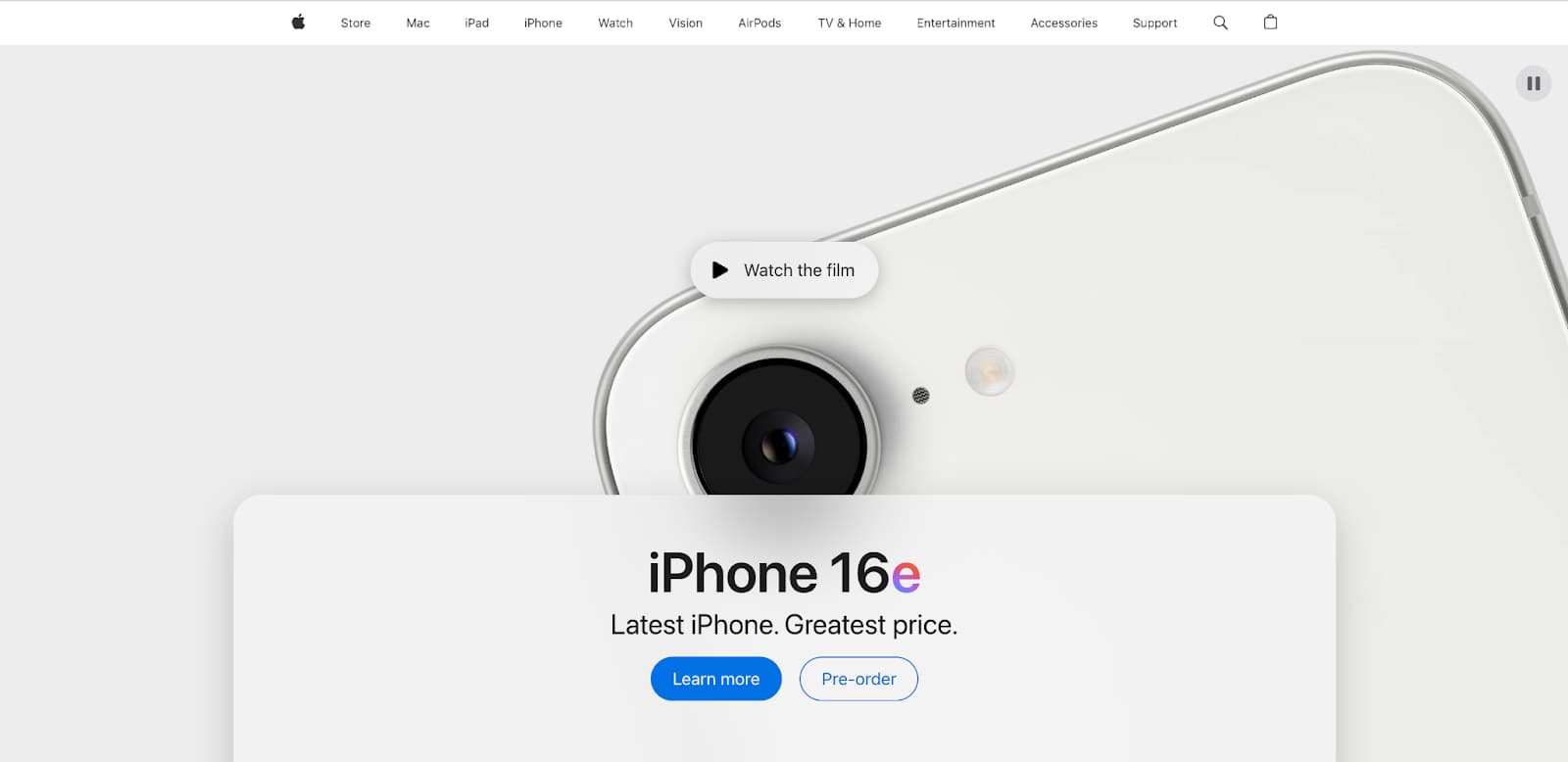
A hero section is the first major section of a page. It should quickly communicate what the page is about, why it matters, and what the visitor can do next.
This lesson teaches how to plan and build a responsive hero section with clear content, a meaningful visual, and a strong call to action.
You will focus on structure, hierarchy, responsive layout, accessibility, and performance.
Above the Fold, Without Cramming
The fold is the part of a page visible before scrolling. It matters because it shapes the first impression, but it is not a fixed pixel line.
The first viewport should establish purpose and direction. It is okay if the next section is partially visible, and it is usually better than cramming everything into one screen.
Mobile screens, browser chrome, zoom settings, and device sizes all change where the fold appears.
Hero Section Anatomy
| Part | Purpose |
|---|---|
| Headline | Names the offer, project, product, place, or main idea clearly. |
| Supporting copy | Adds context without repeating the headline. |
Primary CTA | Gives the visitor one obvious next action. |
| Visual media | Shows the product, project, mood, or subject when it helps understanding. |
Secondary CTA | Offers a lower-priority alternative, such as learning more. |
| Trust cue or context | Adds useful evidence, metadata, category, or audience context. |
Designing the First Viewport
- Make the headline specific. Avoid vague lines like "Welcome to my website."
- Keep supporting copy short enough to scan.
- Make the primary
CTAvisually obvious. - Leave enough space around text so the hero does not feel cramped.
- Let the next section peek into view when possible so the page invites scrolling.
CTA Guidance
A CTA, or call to action, should say what happens next. For navigation actions, use an a element instead of a button.
| Weak CTA | Stronger CTA |
|---|---|
| Click here | View Projects |
| Learn more | Explore the Case Study |
| Submit | Request a Quote |
| Go | Start Planning |
Mobile-First Hero HTML
Start with semantic HTML. Keep important text as real text, not baked into an image.
<section class="hero">
  <div class="hero__content">
    <p class="hero__eyebrow">Portfolio</p>
    <h1>Designing useful websites for local creative businesses</h1>
    <p>
      I build responsive sites that pair clear content with thoughtful visual design.
    </p>
    <a class="button" href="#projects">View Projects</a>
  </div>

  <img
    class="hero__image"
    src="studio-work.jpg"
    alt="Laptop showing a portfolio website layout on a desk"
  >
</section>
Mobile-First Hero CSS
The base styles work for small screens first. The larger-screen media query adds the two-column layout.
.hero {
  display: grid;
  gap: 2rem;
  padding-block: 4rem;
  padding-inline: 1rem;
}

.hero__content {
  max-width: 42rem;
}

.hero__image {
  border-radius: 8px;
  height: auto;
  width: 100%;
}

@media (min-width: 768px) {
  .hero {
    align-items: center;
    grid-template-columns: 1fr 1fr;
    padding-block: 6rem;
  }
}
Hero Layout Patterns
| Pattern | Use When |
|---|---|
| Stacked hero | The page needs a simple headline, copy, CTA, and visual that stack naturally on mobile. |
| Two-column hero | The visual and copy are equally important on wider screens. |
| Image-background hero | The image is decorative and text contrast can stay readable. |
| Editorial hero | The page needs a strong headline and supporting metadata more than a product-style CTA. |
| Product hero | The page needs to show the product clearly in the first viewport. |
Responsive Typography
Hero headlines can be larger than body text, but they still need controlled line length and readable wrapping.
.hero h1 {
  font-size: 2.5rem;
  line-height: 1.2;
  max-width: 12ch;
}

@media (min-width: 768px) {
  .hero h1 {
    font-size: 4rem;
  }
}
Hero Images and Backgrounds
Choose media based on meaning. If the image communicates important content, use an img element with useful alt text.
If the image is purely decorative, a CSS background-image can be appropriate.
- Do not put important words inside an image.
- Do not rely on a background image if the user needs to understand the image content.
- Check text contrast when text sits over an image.
- Avoid distorted images by using
width: 100%,height: auto, orobject-fit: coverwhen cropping is intentional.
Accessibility Checklist
- Use one clear
h1for the page topic. - Use descriptive CTA text, not "Click here."
- Use a real link for navigation CTAs and a real
buttonfor actions that happen on the page. - Write meaningful
alttext for meaningful images. - Keep text contrast readable over images and color backgrounds.
- Do not rely only on motion, video, or color to communicate meaning.
- Provide captions or transcripts when video content is meaningful.
Performance Checklist
- Compress hero images before adding them to the site.
- Use image dimensions close to the size needed in the layout.
- Consider modern formats like
WebP. - Avoid enormous images that slow down the first page load.
- Do not lazy-load the primary above-the-fold hero image if it is important to the first render.
- Avoid autoplaying heavy video unless it is essential and optimized.
Study Real Hero Sections
When studying real examples, do not just copy the look. Ask what the hero is doing.
- What is the page about?
- What is the main visual signal?
- What is the primary CTA?
- What changes between mobile and desktop?
- Is the text readable over the image or background?
- Does the first viewport invite scrolling?


Common Mistakes
| Mistake | Why it hurts | Fix |
|---|---|---|
| Vague headline | Visitors do not know what the page offers. | Name the product, project, service, or topic clearly. |
| CTA looks like normal text | The next action is easy to miss. | Style the primary CTA as a clear link/button. |
| Low contrast over image | Text becomes hard to read. | Add a stronger overlay, move the text, or choose a calmer image. |
| Image distorts on mobile | The page feels unpolished. | Use flexible image sizing and intentional cropping. |
| Hero is too tall | Users cannot see what comes next. | Reduce padding or let the next section peek into view. |
| Important content hidden on mobile | Small-screen users miss key information. | Prioritize and simplify instead of removing meaning. |
Code Challenge: Build Your Own Responsive Hero Section
Create a hero section for a fictional website or your own portfolio. Include a headline, supporting text, a primary CTA, and a meaningful visual.
Build mobile-first, then add a larger-screen layout with @media (min-width: ...).
Checkpoint
Before moving on, make sure these feel true.
- I can explain the main concept in my own words.
- I can apply this lesson to my current project.
- I can verify the result in the browser.
- I can commit the change with a clear message.
Practice
- Build a responsive hero section with a hero image, headline, supporting text, and CTA.
- Write three specific hero headline options before choosing one.
- Use an
aelement for a navigation CTA such asView Projects. - Build the hero mobile-first, then add a two-column layout at a wider screen size.
- Add a responsive image with meaningful
alttext. - Check the hero at
320px, tablet width, and desktop width. - Check text contrast over any image or colored background.
- Make sure the hero does not hide all following content on mobile.
- Compress the hero image and confirm it is not oversized for the layout.